Power BI offers a lot of possibilities to bring your data set to life with vibrant and interactive visuals and a pallet of colours. But it comes with endless design options. We can hear you asking which visuals fit the best, which colour theme should I choose, how can I create a report that is easy to read and tells my story?
Here are some tips and tricks to build dashboards easy to read and understand.
1. Use a simple design
Keeping a report simple and lean will make it easier to read, so try not to clutter it with too many colours and visuals.
Choose a custom colour theme; when creating internal reports, use your company’s logo and colour theme, or if it is an external report for a client use their logo and colour theme. Your marketing department or your client can provide you with the correct RGB or HEX codes that you need. You can customise your theme and make a template so you don’t have to do it every time you create a new report.
Every form of visuals should add value to your reports. Try to avoid adding any extra effects such as 3D lines, shadows that can distract the audience from understanding your story. Use a white background so that the visuals can stand out.
2. Plan ahead
Think briefly before choosing your visuals. Each specific set of numbers or data tells its own story and needs its own visual. Think about what these numbers tell you, which trend they show, and then select the visual to underline your story. Also, know who your audience is and what is their experience level in reading dashboards. Data analysts work with data every day, but a lot of your users might not feel comfortable in the world of data. You want your audience to understand what you are telling in the blink of an eye. Choose your visuals wisely depending on how experienced your audience is. For example, bar and line charts are easily understood by everyone.
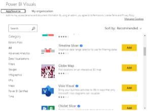
Although Microsoft has a broad standard of default visuals, take a look in the Microsoft AppSource to see what is out there! These visuals are created by Microsoft and Microsoft partners, and are tested and validated by the AppSource validation team.
Don’t be afraid to experiment with new visuals but always keep in mind it is understandable without (a lot of) explanation.

3. Stick to the story
Large data sets can create an easy trap of wanting to show more than necessary. A common mistake is to try showing too much information at once with tons of numbers, complex (3D) graphs, or too many filters. Keep in mind what the goal of the dashboard is, and what questions you want to be answered. If you want to do a deep dive, you can use drillthrough or create multiple pages and connect them with navigation bookmarks.
Compared to static data sets, dashboards and visuals tell much more at once. And, your dashboards can become even more dynamic with filters. Using a (hidden) slicer panel can help you save space on your report and your audience can focus their attention on the visuals. With the slicer bar you can group all filters and the bar can be hidden when the filters are selected making the dashboard more interactive. A small button with any icon you want will show and hide the slicer panel and it will cover only a small part of your report.
4. Name your visuals
Add a clear but short title that explains the objective of your visual. Make sure to name the values on the axis to avoid any confusion. You can show the values inside of the visuals to add more clarity. In some cases, it can be wise to add a short definition (either written or the calculation) to your report to support your audience in understanding the visual.
Power BI is a very intuitive tool that helps users create insightful reports. It’s customisable and comes with numerous visualisation options. Remember to stick to the story you want to tell in your reports and Power BI will support you along.
At Rojo, we help our customers build an IT Managed Self Service BI Environment in their organisations with our Power BI trainings. Get in touch to learn more about the Power BI Admin and Power User trainings.


